这种css布局平时用的比较多,也是面试题常出的一个题,网上一搜一大丢,不过还是想自己总结一下。
这种方法比较多,本文只总结其中的几种,以便加深印象。
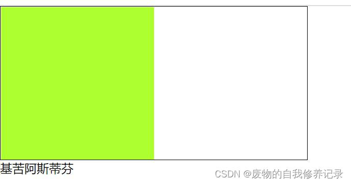
效果图都为这个:
方法一:position加margin
- <divclass="wrap">
- <divclass="center"></div>
- </div>
- /**css**/.wrap{width:200px;height:200px;background:yellow;position:relative;
- }.wrap.center{width:100px;height:100px;background:green;margin:auto;position:absolute;left:0;rightright:0;top:0;bottombottom:0;
- }
兼容性:主流浏览器均支持,IE6不支持
方法二:diaplay:table-cell
- <!--html-->
- <divclass="wrap">
- <divclass="center"></div>
- </div>
- /*css*/.wrap{width:200px;height:200px;background:yellow;display:table-cell;vertical-align:middle;text-align:center;
- }.center{display:inline-block;vertical-align:middle;width:100px;height:100px;background:green;
- }
兼容性:由于display:table-cell的原因,IE67不兼容
方法三:position加 transform
- <!--html-->
- <divclass="wrap">
- <divclass="center"></div>
- </div>
- /*css*/.wrap{position:relative;background:yellow;width:200px;height:200px;}.center{position:absolute;background:green;top:50%;left:50%;-webkit-transform:translate(-50%,-50%);transform:translate(-50%,-50%);width:100px;height:100px;
- }
兼容性:ie9以下不支持 transform,手机端表现的比较好。
方法四:flex;align-items: center;justify-content: center
- <!--html-->
- <divclass="wrap">
- <divclass="center"></div>
- </div>
- /*css*/.wrap{background:yellow;width:200px;height:200px;display:flex;align-items:center;justify-content:center;
- }.center{background:green;width:100px;height:100px;
- }
移动端首选
方法五:display:flex;margin:auto
- <!--html-->
- <divclass="wrap">
- <divclass="center"></div>
- </div>
- /*css*/.wrap{background:yellow;width:200px;height:200px;display:flex;
- }.center{background:green;width:100px;height:100px;margin:auto;
- }
移动端首选
方法六:纯position
- <!--html-->
- <divclass="wrap">
- <divclass="center"></div>
- </div>
- /*css*/.wrap{background:yellow;width:200px;height:200px;position:relative;
- }/**方法一**/.center{background:green;position:absolute;width:100px;height:100px;left:50px;top:50px;
- }/**方法二**/.center{background:green;position:absolute;width:100px;height:100px;left:50%;top:50%;margin-left:-50px;margin-top:-50px;
- }
兼容性:适用于所有浏览器
方法六中的方法一计算公式如下:
子元素(conter)的left值计算公式:left=(父元素的宽 - 子元素的宽 ) / 2=(200-100) / 2=50px;
子元素(conter)的top值计算公式:top=(父元素的高 - 子元素的高 ) / 2=(200-100) / 2=50px;
方法二计算公式:
left值固定为50%;
子元素的margin-left= -(子元素的宽/2)=-100/2= -50px;
top值也一样,固定为50%
子元素的margin-top= -(子元素的高/2)=-100/2= -50px;
方法七:兼容低版本浏览器,不固定宽高
- <!--html-->
- <divclass="table">
- <divclass="tableCell">
- <divclass="content">不固定宽高,自适应</div>
- </div>
- </div>
- /*css*/.table{height:200px;/*高度值不能少*/width:200px;/*宽度值不能少*/display:table;position:relative;float:left;background:yellow;
- }.tableCell{display:table-cell;vertical-align:middle;text-align:center;
- *position:absolute;padding:10px;
- *top:50%;
- *left:50%;
- }.content{
- *position:relative;
- *top:-50%;
- *left:-50%;background:green;
- }
暂时总结上面的七种,这种方法太多,其实只要习惯了其中的一两种也就够用了。
总结
如果是移动端,那么用方法四和方法五是比较方便的。而且支持不固定宽高的情况,快、准、狠
也就是用 flex; align-items: center; justify-content: center;
- <!--html-->
- <divclass="wrap">
- <divclass="center"></div>
- </div>
- /*css*/.wrap{background:yellow;width:200px;height:200px;display:flex;align-items:center;justify-content:center;
- }.center{background:green;width:100px;height:100px;
- }
或者display:flex;margin:auto;
- <!--html-->
- <divclass="wrap">
- <divclass="center"></div>
- </div>
- /*css*/.wrap{background:yellow;width:200px;height:200px;display:flex;
- }.center{background:green;width:100px;height:100px;margin:auto;
- }
如果是PC端,要考虑兼容性的话。方法六是不错滴,也就是纯position。
- <!--html-->
- <divclass="wrap">
- <divclass="center"></div>
- </div>
- /*css*/.wrap{background:yellow;width:200px;height:200px;position:relative;
- }/**方法一**/.center{background:green;position:absolute;width:100px;height:100px;left:50px;top:50px;
- }/**方法二**/.center{background:green;position:absolute;width:100px;height:100px;left:50%;top:50%;margin-left:-50px;margin-top:-50px;
- }
如果PC端的中间的元素高度不固定,那么就用方法七即可,代码就不复制了。
这种css元素垂直的如果真的要总结起来,应该有十几二十几种。不过也没必要全部掌握吧,只要大概了解一些,用起来没有副作用就行。
以上就是本文的全部内容,希望对大家的学习有所帮助,也希望大家多多支持。