公园里的草真绿啊,绿得让你感觉那是一块绿地毯;公园里的草真密啊,密得看不见泥土;公园里的草真柔啊,微风一吹,它们就翩翩起舞。
原理
父级元素 relative,子元素 absolute,然后通过top、left、right、bottom来设置具体出现位置。
DOM结构
<div class="wrapper-dashed">
    <div class="dashed"></div>
</div>
CSS样式
.wrapper-dashed{
    position: relative;
    height: 1px;
    width: 100%;
}
/*虚线实现*/
.dashed {
    border-top: 1px dashed #cccccc;
    height: 1px;
    overflow: hidden;
}
.dashed:before, .dashed:after{
    display: block;
    position: absolute;
    content: "";
    width:10px;
    height:10px;
    background-color:#f3f5f9;
    border-radius:50%;
    top: -5px;
}
.dashed:before{
    left: -5px;
}
.dashed:after{
    right: -5px;
}
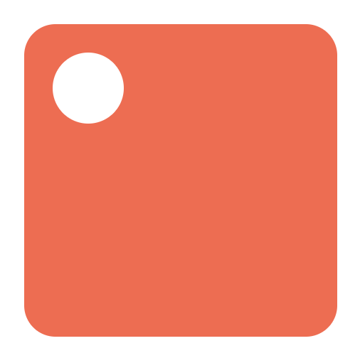
效果图
到此这篇关于CSS如何实现反方向圆角的示例代码就介绍到这了。忍别人所不能忍的痛,吃别人所别人所不能吃的苦,是为了收成得不到的收成。更多相关CSS如何实现反方向圆角的示例代码内容请查看相关栏目,小编编辑不易,再次感谢大家的支持!