秋天来啦,秋天来啦;天空像一块覆盖在大地上的蓝宝石,它已经给秋风抹试得洁净而明亮。棉花笑嘻嘻的来了,它听说好朋友—秋姑娘来了,笑的咧开了嘴。玉米在房顶上唱着歌跳着舞,别提多开心了。路边两只黑色的小狗在玩耍,看它那可爱的样子,让人忍不住的笑。石榴也许太兴奋了,竟然笑破了肚皮,苹果跑着来了,当然脸蛋是红彤彤的。
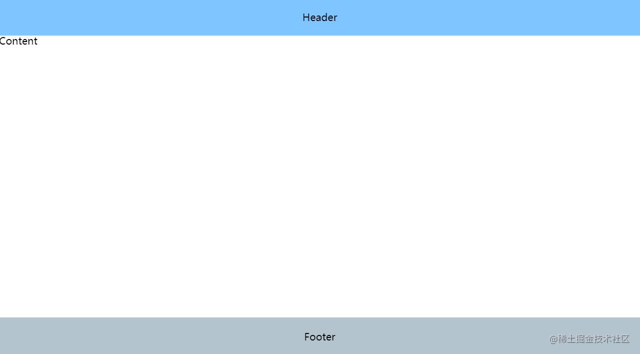
本文介绍了详解css布局实现左中右布局的5种方式,分享给大家,具体如下:
效果如下:
左中右布局
<!doctype html>
<html lang="en">
<head>
    <meta charset="UTF-8">
    <meta name="viewport"
          content="width=device-width, user-scalable=no, initial-scale=1.0, maximum-scale=1.0, minimum-scale=1.0">
    <meta http-equiv="X-UA-Compatible" content="ie=edge">
    <title>Document</title>
    <style>
        html *{
            margin: 0;
            padding: 0;
        }

        article{
            height: 100px;
        }
        section{
            margin-top: 10px;
        }

        .left{
            width: 300px;
            height: 100px;
            background-color: #823384;
            text-align: center;
            font-size: 20px;
            color: #fdf6e3;
        }
        .center{
            height: 100px;
            background-color: #d29922;
        }
        .right{
            width: 300px;
            height: 100px;
            background-color: #0c8ac5;
            text-align: center;
            font-size: 20px;
            color: #fdf6e3;
        }

    </style>
</head>
<body>
<!--浮动布局-->
<!--左浮动, 右浮动, 中间自动填充-->
<section class="layout float">
    <style>
        .float article div{

        }
        .float article .left{
            float: left;
        }
        .float article .right{
            float: right;
        }
        .float article .center{
        }

    </style>


    <article class="left-right-center">

        <div class="left">左边</div>
        <div class="right">右边</div>
        <div class="center"><h1>
            浮动float布局:
        </h1> 左元素: float: left; 右元素: float: right; 中间元素:自动填充</div>

    </article>
</section>

<!--绝对定位-->
<section class="layout absolute">
    <style>
        article{
            position: relative;
        }

        .absolute .left-center-right div{
            position: absolute;
        }

        .absolute .left-center-right .left{
            left: 0;
        }

        .absolute .left-center-right .center{

            left: 300px;
            right: 300px;
        }

        .absolute .left-center-right .right{
            right: 0;

        }

    </style>
    <article class="left-center-right">

        <div class="left">左边</div>
        <div class="center"><h1>
            绝对absolute定位布局:
        </h1> 左边元素: position: absolute; left: 0;

            右边元素: position: absolute; right:0; 中间元素: position: absolute;left:300px; right: 300px;
        </div>
        <div class="right">右边</div>
    </article>
</section>

<!--flex布局-->
<section class="layout flexbox">

    <style>

        .flexbox .left-center-right{

            display: flex;

        }
        .flexbox .left-center-right .left{

        }
        .flexbox .left-center-right .center{

            flex:1;
        }

        .flexbox .left-center-right .right{

        }

    </style>

    <article class="left-center-right">
        <div class="left">左边</div>
        <div class="center"><h1>
            flex布局:
        </h1> 父元素display:flex; 左右子元素设置宽度300px; 中间子元素设置flex:1;</div>
        <div class="right">右边</div>
    </article>
</section>

<!--表格布局-->
<section class="table-box layout">
    <style>
        .table-box .left-center-right{
            width: 100%;
            display: table;
        }

        .table-box .left-center-right>div{

            display: table-cell;

        }

        .table-box .left-center-right .left{
        }

        .table-box .left-center-right .center{
        }

        .table-box .left-center-right .right {
        }

    </style>
    <article class="left-center-right">
        <div class="left">左边</div>
        <div class="center"><h1>
            表格table布局:
        </h1> 父元素width: 100%; display: table;
            左右子元素display: table-cell; width: 300px; </div>
        <div class="right">右边</div>
    </article>
</section>

<!--网格布局-->
<section class="grid layout">
    <style>

        .grid article{
            display: grid;
            width: 100%;
            grid-template-rows: 100px;
            grid-template-columns: 300px auto 300px;
        }

    </style>
    <article class="left-center-right">
        <div class="left">左边</div>
        <div class="center"><h1>
            网格grid布局:
        </h1> 父元素宽度为100%,
            父元素width: 100%; display:grid; grid-template-rows: 100; grid-template-columns: 300px auto 300px</div>
        <div class="right">右边</div>
    </article>
</section>
</body>
</html>
以上就是详解css布局如何实现左中右布局的5种方式。打价值战,而不打价格战。更多关于详解css布局如何实现左中右布局的5种方式请关注haodaima.com其它相关文章!