有时候阳光很好,有时候阳光很暗,这就是生活。不就应迫求一切种类的快乐,就应只追求高尚的快乐。
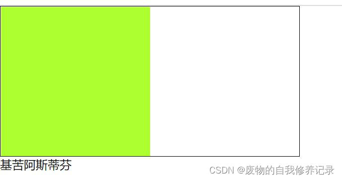
首先附上效果图:
以上的效果完全是用 css 来实现的,那么是怎么实现的呢?
我们知道 html 中有一些特殊的字符,具体的请点击 HTML特殊字符大全。
通过特殊字符,利用 css 中的 margin 或者 position 方法完全可以实现以上效果。
复制代码
代码如下:<!DOCTYPE HTML>
<html lang="en-US">
<head>
<meta charset="UTF-8">
<title>字符制作三角边框</title>
<style type="text/css">
*{margin:0;padding:0;}
body{font-family:SimSun;}
h1{text-align:center;}
.demo1{width:300px;margin:20px auto;border:1px solid red;height:100px;}
.demo1 em,.demo1 span{display:block;width:30px;height:16px;font-size:30px;overflow:hidden;_position:relative;margin-left:10px;}
.demo1 em{margin-top:-16px;color:red;font-style:normal;}
.demo1 span{margin-top:-14px;color:white;}
.demo2{width:300px;border:1px solid #F00;height:100px;position:relative;margin-left:auto;margin-right:auto;}
.demo2 em,.demo2 span{font-style:normal;font-size:30px;position:absolute;left:-16px;top:40px;color:red;}
.demo2 span{left:-14px;color:white;}
</style>
</head>
<body>
<h1>demo1 是用 margin 方法</h1>
<div class="demo1">
<em>◆</em>
<span>◆</span>
</div>
<h1>demo2 是用 position 方法</h1>
<div class="demo2">
<em>◆</em>
<span>◆</span>
</div>
</body>
</html>
PS:除了用字符可以实现三角,我们还可以利用 border 来实现三角。具体地址:https://www.haodaima.com/css/33748.html
到此这篇关于纯css制作带三角的边框(附效果图)就介绍到这了。生活中,有人给予帮助,那是幸运,没人给予帮助,那是命运。我们要学会在幸运青睐自己的时候学会感恩,在命运磨练自己的时候学会坚韧。更多相关纯css制作带三角的边框(附效果图)内容请查看相关栏目,小编编辑不易,再次感谢大家的支持!