在小溪的淙淙声中,饱含树脂的幼芽在开放,水下的草长出水面,岸上青草越发繁茂。雨滴从屋檐、墙头、树叶上跌下,就如同断了线的珠子一样,最后连在一起,形成水柱。
准备
创建元素
<div class="parent">
  <div class="child">child</div>
</div>
垂直水平居中方案一:知道宽度的情况下 absolute+margin负值
.parent {
  width:400px;
  height:400px;
  background: red;
  position: relative;
}
.child {
  position: absolute;
  left:50%;
  top:50%;
  background: yellow;
  width:50px;
  height:50px;
  margin-left:-25px;
  margin-top:-25px;
}
垂直水平居中方案二:不知道宽高的情况下 absolute+transform
.parent {
  width:400px;
  height:400px;
  background: red;
  position: relative;
}
.child {
  position: absolute;
  left:50%;
  top:50%;
  transform: translate(-50%,-50%);
}
垂直居中方案三:position+margin:auto
.parent {
  position:relative;
  width:200px;
  height:200px;
  background: red;
}
.child {
  width:80px;
  height:40px;
  background: yellow;
  position: absolute;
  left:0;
  top:0;
  right:0 ;
  bottom:0;
  margin:auto;
}
垂直居中方案四:+ 多行文本的垂直居中 :table-cell+vertical-align:middle;
.parent {
    height: 300px;
    width:400px;
    border: 1px solid red;
    display: table-cell;
    vertical-align: middle;
    text-align: center;
}
.child {
  display: inline-block;
  width:50px;
  height:50px;
  background: blue;
}
/* 或者 */
.parent {
    width: 400px;
    height: 300px;
    display: table-cell;
    vertical-align: middle;
    border: 1px solid red;
    text-align: center;
}
.child {
    display: inline-block;
    vertical-align: middle;
    background: blue;
}
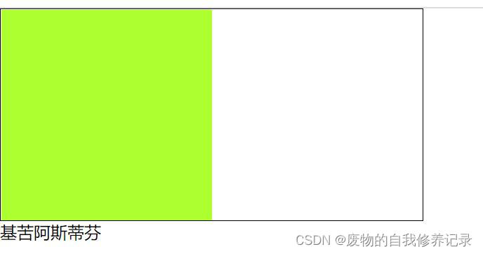
垂直居中方案五:display: flex
.parent {
  width:400px;
  height:200px;
  background:red;
  display: flex;
  justify-content:center;
  align-items:center;
}
.child {
  height:100px;
  width:100px;
  background:green;
}
垂直居中方案六:伪元素
.parent {
  width:200px;
  height:200px;
  background:red;
  text-align: center;
}
.child {
  height:100px;
  width:100px;
  background:yellow;
  display: inline-block;
  vertical-align: middle;
}
.parent:before {
  content:"";
  height:100%;
  vertical-align: middle;
  display: inline-block;
}
本文CSS水平垂直居中如何解决方案(6种)到此结束。未曾失败的人恐怕也未曾成功过。小编再次感谢大家对我们的支持!